The biggest challenge for me was to follow directions first and experiment later...it cost me sooo much time. It seemed that that I found all of the places to cause the map system to do something different than I intended because a box was inadvertently selected or deselected...
I think two issues for real world data sets would be completeness, and accuracy. It would make this kind of analysis so difficult the data was was erroneous or lumpy.
Thursday, January 28, 2010
Sunday, January 24, 2010
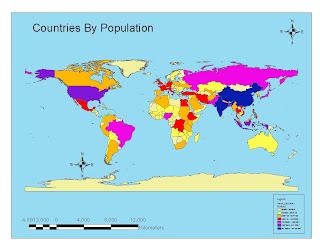
Week 2 - World Population Map

This was interesting.
One of the things that I paid attention to was the range of colors. In the last exercise, which included bad maps, there was one that was poor for those with color blind issues. Since that often has to do with blue and green, that thought process was incorporated into the design to minimize that effect.
My biggest challenge was due to my effort to clean up my desktop. I inadvertently closed the "tools" tool bar but did not remember that it was called "tools". Then I had to go through lots of tool bars until I found it again ... and laughed at myself. I did discover that if you double click on an empty space on the tool bar area it brings up a dialogue box and you can flip through these pretty fast.
Wednesday, January 20, 2010
Tourism map of San Diego
I had a lot of fun playing with this one. As with my previous post, I learned to use several tools that I had never used before. In the end I added a label showing where Qualcomm Stadium was since it was not obvious on the map.
Just for grins, I also saved the map as a screen snap. This works well but requires more editing after.
Just for grins, I also saved the map as a screen snap
Tuesday, January 19, 2010
Potential Youth Center Locations
The biggest issue I had actually had nothing to do with the assignment. For some reason a new Remote Access tool at work changed and subsequently prevented me from accessing the student account for three days...That had me sweating...
Subscribe to:
Comments (Atom)


