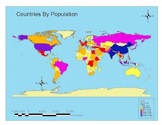
This was interesting.
One of the things that I paid attention to was the range of colors. In the last exercise, which included bad maps, there was one that was poor for those with color blind issues. Since that often has to do with blue and green, that thought process was incorporated into the design to minimize that effect.
My biggest challenge was due to my effort to clean up my desktop. I inadvertently closed the "tools" tool bar but did not remember that it was called "tools". Then I had to go through lots of tool bars until I found it again ... and laughed at myself. I did discover that if you double click on an empty space on the tool bar area it brings up a dialogue box and you can flip through these pretty fast.
No comments:
Post a Comment