Saturday, June 25, 2011

Homeland Security (Protect)

Deliverables:
  1. Process Summary (.doc)
    1. Explain your steps.
    2. Answer any questions (1) 
  2. Blog Post materials to your blog
  3. 3 Maps (JPEG) 
    1. Map of heliport.
    2. Map of ingress and egress points around heliport.Line of Sight
    3. Map with profile graph incorporated into it.  
    4. 1 JPEG (Exported from 3-D) 
    5. JPEG of 3-D line of sight 
  4. Power Point Presentation

Objectives: Upon completion of this lab students should be able to: 
  • Create a hillshade surface in ArcMap 
  • Create a new shapefile within ArcCatalog. 
  • View 3D data in ArcScene.
Section 2.1: Prepare Protect Scenario Map 1
In this scenario, a threat is made targeting the NORAD command center at Cheyenne Mountain. Due to the nature of this threat, the site is regarded as the primary critical infrastructure and a number of key resources in and around the site are considered secondary critical infrastructure
I. Add MEDS Data to Scenario Map
II. Create Buffer around Extended Area beyond Event Site

Section 2.2: Locate Critical Infrastructure
Locate those key resources within this zone that may be potential secondary targets. These sites will also require additional security measures to step up surveillance to monitor activities in and around them to prevent terrorists from staging secondary incidents that may threaten the safety of the people in the area.

  1. Select by Location (Completely Within) 
  2. Summarize Data in a Table  
Section 2.3: Protect Critical Infrastructure Maps 3 & 4

I. Create Protective Security Buffer Zone around Critical Infrastructure

Deliverable 1: Buffers of the Cheyenne Mt. Airport/Heliport
A map was created illustrating the buffer zone surrounding the Heliport within the larger buffer zone. Remember, we had an entire data set at our disposal. A reference map showing where in the U.S. this data was added. The military map template was used to implement this deliverable

  
Deliverable 2: SECURE INGRESS AND EGRESS ROUTES AROUND CRITICAL INFRASTRUCTURE
A map was created illustrating these points surrounding Heliport. The Military Portrait template was used per lab recommendation.

Secure Ingress and Egress Routes around Critical Infrastructure
A. Generate Hillshade
  1. Create new shapefile of surveillance points in ArcCatalog 
  2. Add new shapefile to map document
B. Generate Viewshed
C. Create line of sight
D. Create line-of-sight profile graph
Deliverable 3: Create Line of Sight Profile Graph
A map was created incorporating the profile graph into layout view of representative observation point and create a map illustrating completion of the task. Per lab directions additional layers/data frames were incorporated to add value to the map.

Deliverable 4: View 3-D Line of Sight;

This is a frame grab since ArcScene crashed each time the export was initiated. So as long as I was grabbing the Arc Scene, I chose to also grab the source and present it as a side-by-side view. Notice that the selected LOS line is down the center of the road to NORAD.
   

Section 2.4 Create Power Point Presentation
 Homeland Security and LOS.pptx This presentation summarizes the Prepare lab tasks (gathering and preparing data) and results for the Protect lab.  The conclusion, provides at least two examples of where and how a line of sight analysis could be used to aid homeland security.

Tuesday, June 14, 2011

Class Participation Lab - Summarize a Technical Paper

Assignment: Summarize Exploratory Spatial Data Analysis Techniques for Examining Urban Crime.  http://www.geography.hunter.cuny.edu/~dougwill/CRIME/web_pdfs/intro_ESDA_murray-etal2001.pdfAlan T Murry, Ingrid McGffog, John S Western, and Patrick Mullins.

This article provided an in depth detailing of “approaches for better understanding relationships of crime occurrences using a GIS and quantitative techniques”. The authors clearly explained the challenges of producing a quality GIS product (Examining Urban Crime): establishing what data is needed to meet the customer’s needs; determining how much data to put on the map while setting aside the basic map design theory; trying to sort through the wealth of data to be displayed by a GIS; and making a map or GIS product. The daunting goal of using a GIS in support of crime analysis is to produce products that tell the right story for the given audience.

I was most surprised to learn that with respect to the GIS there are no standard models for examining urban crime. There are many generalized assumptions that can be made but each must be tested for validity, accuracy, and precision. The panoply of data options combined with the ever growing GIS capabilities makes this kind of work quite exciting. GIS is still in its infancy and only in the last few years emerging and gaining acceptability in the study of crime events and the relationships to the physical surroundings.

Thursday, June 9, 2011

Analysis of DC Area Crime using GIS

Assignment: Complete the lab (4 maps total).

Deliverables:
  1. 4 Maps
    1. A basemap of Washington D.C which includes:
      1. Police Stations
      2. Crimes
      3. Roads
      4. Census Block group
    2. A map of police stations, locations of crime, recommendations for new substations.
    3. A density map of burglaries, homicides, sex abuse crimes
    4.  GRADUATES ONLY: A map showing schools with the highest number of crimes nearby
  2. 1 Bar Graph showing total crimes (from deliverable 1 map).
  3. Process Summary Worksheet (delivered to instructor)
    1. Fill in tables
    2. Answer questions 29 total for graduates
    3. Explain your steps
Objectives: Upon completion of this lab students should be able to:
  • Create a map showing crime in urban areas.
  • Create graphs using ArcMap¡¦s Create Graph Wizard.
  • Analyze crime data for urban areas.
Law enforcement agencies increasingly are adopting GIS as a tool to improve public safety. Officials can decide where and how to allocate their resources once they pinpoint crime clusters. Spatial data helps police explore various factors contributing to crime.


In this exercise we used data from the nation’s capital to perform a crime analysis. The data comes from the DC Metropolitan Police Department and is compiled yearly into a database available for download at http://data.dc.gov/

Process summary
The DC Metropolitan Police Department has the technology available for crime analysis to allocate patrol resources efficiently. Imagine that you are a department GIS analyst who has been directed to investigate the following:

  • Crime patterns in proximity to police stations to determine if current patrols are effective or adjustments are necessary, such as reorganizing beats and building new substations.P
  • Patterns of aggravated assault, homicide, and theft-related crimes.
  • Patterns of when crimes are committed.
Process.
Step 1. Examine the data
Step 2. Create a process summary. This is where we explore the data. Look for value, consistency, and relevance. Once these are acceptable, then produce a base map which in this case show police stations, crimes, and roads. You will also see a graph showing the number of occurances of each type of offence.

Then put it all together by producing a map of the police stations and the locations of the crimes.

Step 3. Document the Map. Keep good descriptive names and steps along the way to avoid confusion. Try to make it easy for someone else step in with little or no prior knowledge. Or for people like me, make the names easy to remember and the storage locations logical.

Step 4. Set the environments. This is a key step since the real world data is comprised of formats and for our needs, a variety of coordinate systems and/or map projections. In this case I followed a series of 13 steps to get this done. Then saved it and called it Crime_Baseline. I would use this baseline through out the lab and save many, many steps and thus avoid mistakes

Deliverable 1: A basemap of Washington D.C. showing police stations, crimes, roads and census block groups. Include a graph of total crimes.


Deliverable 2: A map of police stations and locations of crimes along with recommendations for new police substations sites.
Deliverable 3: Density maps of burglaries, homicides, and sex abuse crimes.
Deliverable 4: A map identifying schools with highest number of crimes nearby
  • Imported the juvenile crime data (following lab steps)
  • Converted to .shp since it would not take the XY data projection any other way
  • Created a 1000 foot buffer around the schools with Proximate tool (contained)
  • Joined those two files
  • Voila

Tuesday, June 7, 2011

Joplin Missouri, Tornado

Graduate Student Lab: Joplin, Missouri Tornado

Topics covered: Creating geodatabases, ArcGIS Explorer, creating emergency maps related to the Joplin, Missouri Tornado.
Data Sources: UWF, Joplin and U.S.Census Bureau
Assignment: See Below.
Deliverables:

2 Maps
  • A map of Joplin, Missouri showing county boundary and schools
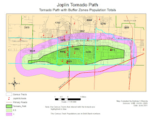
  • A map of buffered areas around the tornado path. The map should show the following:
    • School locations 
    • Population estimate 
    • Impacted roads 
1 Process Summary explaining the steps taken in each part of the lab.

Update Blog
  • Post maps 
  • Process summary
Objectives: Upon completion of this lab students should be able to:

  • Create a Geodatabase. 
  • Display emergency information via ArcMap.
  • Collect census, school, and boundary data from online sources.
Scenario
The city of Joplin, Missouri suffered significant damage. For this assignment your task is to survey the areas of Joplin that were impacted by this disastrous tornado. You will examine the tornadoes path; locate schools and shelter that were affected by the tornado and determine the population density of the area impacted.

Part I: First Response Analysis

Step 1: Created a Base Map of Jasper County, Missouri

  • Find data from online sources and bring into ArcMap: 
    • Jasper County Boundary 
    • Roads 
    • Schools 
    • Census Data (see steps taken in Tuscaloosa Lab write up)
    • Census Tract (see steps taken in Tuscaloosa Lab write up)
2. Symbolize the schools and streets appropriately.
3. Label Interstate and major roads.
4. Save the map document to my results directory

Deliverable 1: A map of Jasper County showing roads & schools
Step 2: Identify Tornado Path and Isolate Area of Concern 
  1. Create Buffers around the Tornado Path 
    • Used ArcMap to create a Multiple Ring Buffer (0.5 miles and 1 mile from the tornado path).
    • Made sure the Buffer Unit was set to Miles. There was an interesting effect here. Initially my inner ring for the multipath ended up as .05 miles. I finally figured out (since it was repeatable) that if I chose .5 mile then selected miles from the meter default, the sw sometimes converted the .5 meters to .05 miles. I caught the error when I used the ruler tool to check my distances
  2. Displayed the buffer by “unique value” with distance as the value field.
  3. Experimented with various map display techniques until the I found the one that best expressed what was trying to be told.
  4. Saved the map document.
The next step was to locate Evacuation Areas and Shelters (Schools in this case).

The schools are isolated:
  • Within the tornado path 
  • 1/2 mile from of the tornado path. 
  • 1 mile from the accident scene
Step 3: Add Census Data
A. Download data from the U.S.Census Bureau

  • 1. Download the Census Tract for Jasper County, Mo
  • 2. Download the Census Data Table
http://factfinder2.census.gov/faces/nav/jsf/pages/index.xhtml

The undergraduate lab was used for directions on how to “clean up” the data table. The key learning here was that there must be at least 2 columns of data that contain the identical names and unique values in both tables.

B. Join Census Table to CensusTract layer.
1. Once the data was “cleaned up” I used “Join” option on the Census Data Table to the Census Tract layer for Jasper County. This actually took several attempts until the join finally populated the fields with something other than . You have no idea how happy I was to see the table completed.

C. Determine Population and Roads Affected
Deliverable 2: A Map of the Buffered areas around the tornado path

Sunday, June 5, 2011

Joplin Mo. The value of an online GIS community

This is a map made using ArcGIS online map tool as part of a class participation exercise... Use this link or simply hit the map below.  http://bit.ly/iUF2rN


“Proper Prior Planning Prevents Pathetically Poor Performance”

An old Marine Major I used to work with often quoted this line and it applies very much to preparing for hazards such as Tornados. There must be a sense of urgency when preparing for such things as tornados. We must take responsibility to help where ever we can. As GIS practioners, we can make a difference. Understandably, some areas are more prone to these events than others. I live on the Gulf Coast where tornados are rare but dealing with hurricanes is highly likely. So I am prepared for that type of occurrence.

Who are the stakeholders in these events? “Everyone” is a stakeholder from the federal government down to the individual. In this assignment, we have been directed to think about the debris removal. The EPA site from our assignment has an excellent paragraph what we can do.

“Preparing a disaster debris management plan in advance can pay off in the event of a natural disaster. Planning can help a community identify its debris collection, recycling, and disposal options. Although the recovery process will take a long time, perhaps even years, careful planning will prevent costly mistakes, speed recovery, and avoid creation of more waste. A plan also can save money by identifying cost-effective debris management options and sources of help, increasing control over debris management in your community, and improving administrative efficiency” http://www.epa.gov/osw/conserve/rrr/imr/cdm/pubs/disaster.htm#cando  


Everyone can do something. We (as GIS) folks can put our names into our local authorities as volunteers to do the GIS work. We can use the ArcGIS site to collaborate. This would be useful to the victims, and the helpers (often times the same people). Most of us have printers so we can print out maps for all to use. As one of our esteemed colleagues living through the Joplin tornado pointed out, almost everyone can use a paper map. We can put debris collection sites, hazardous materials sites, first-aid sites etc on these maps. We can and should help because we can and will make a difference!

Saturday, June 4, 2011

A Study of the Tuscaloosa Tornado

Week 4: Tornadoes Tuscaloosa Tornado

There are several things to think about when working with a GIS.
What geographic area are you studying? In this case we are studying the tornado that hit Tuscaloosa Alabama. 

What decision do you need to make? There are so many to ask. Where are the Shelters in Place, what is the size and magnitude of the tornado? Has there been loss of life, where are the hospitals and the emergency support groups like the police, firemen, and EMTs.

What information would help you make the decision? In a sense, everyone is a key stakeholder. In this case, the emergencyworkers were the most critical. Are there  maps of the areas, pre and post tornado. Are there other weather coming to the area such as rain, and lightning? In the Joplin Tornado, a policeman died after being hit by lightning while assisting people in recovery.

Part I: Geodatabases
Summary Notes:
  • Once I added the basic layers I swithched views from data to map
  • Experimented with map scales and orientation until the area within the neat line came close to showing all the imagery, and the tornado path
  • Decide to stay with standard (vs. landscape)
  • Tinkered with colors… Acid green for the tornado path as an impact color 
  • Tornado Icon. Chose a large green dot for the tornadoes since the tornado Icon was too hard to see in this scene. 
  • Chose Red School (for the little red school house) 
  • Could easily see schools within the path: #34 Jamison Elementary, 44 Alberta Elementary, 55 University Place Elementary, 58Holy Cross Lutheran Child Development
  • Made the map with and without converting to Geodatabase. For these few layers it was much easier at the start to complete it with creating the Geodatabase. 
  • Convert labels to annotations graphics to enable individual editing.
  • Added inset for spatial context.
  • Spent much time working on the map composition so it would tell the story I intended 
  • Changed the Road setting several times. Will improve it again for the next map 
  • Sort legend in terms of importance on the map
  • Labeled Interstates and major roads.
  • Added all essential map elements (north arrow, legend, map scale, etc)
  •  Exported map. Deliverable 1 done (at least for now) Most likely tweak it later as I think of ways to improve it.
Deliverable 1: A map of Tuscaloosa County showing roads, schools, and aerial images.

Part II: First Response Analysis
Summary Notes:

  • Throughout process I am highlighting and adding digital notes the TornadoesLab.pdf file to ensure which steps have been completed
  • Created first map saved as deliverable 2a 
  • Added Buffer then saved as Deliverable 2b archived 2a
  • Visual count as a sanity check for estimates later on
  • Ran the MultiBuffer tool 
  • Once Multibuffer was complete, I measured the distances to ensure they were in fact, .5 miles and 1.0 miles of buffer 
  • Played with the layer organization, colors and transparencies until I got this right. 
Key thought.  When working on the map composition, keep foremost in your mind what story the map has to tell.  It must be done in such a way that if my Mom picked it up, she would understand the intent of this product.

Deliverable 2: A map of the buffered areas around the tornado path.  The map should include:
  • Schools within the tornado path, 0.5 miles and 1.0 miles from the path.
  • A population label on each census tract
  • Roads impacted by the tornado path


Part III: Animation
Deliverable 3: Post the video as a web link to your blog including a brief description along with your summary.


http://students.uwf.edu/avm6/Tornado3.avi

This took three tries. In the end I deleted everything and on the third try it worked like a charm

Part IV: Create a KMZ to view Tornadoes in Google Earth
Notes:
This was interesting and has the potential to be VERY powerful as a community GIS. Anyone with a computer can logon and use this tool. They can add and/or use existing map products. It was fun to take a shape file, convert it to a .kmz and drop it into Google Earth and then put it into my class blog.

Deliverable 4: Post the kmz file as a web link to your blog including a brief description along with your summary.
Google Earth Tornado Path 

Download Google Earth for PC, Mac, or Linux to use the GE Tornado Path link.  If you are not so inclined then click this link for a Screen Grab of Tornado Path in Google Earth