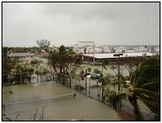
Sunday, May 29, 2011

Hurricane (A Study of Wilma effects in Key West FL)

Background:
In 2005, Hurricanes Katrina, Rita, and Wilma destroyed homes, businesses, infrastructure, and natural resources along the Gulf and Atlantic coasts. In the aftermath of the storms, federal, state, and local governments, service agencies, and the private sector responded by helping to rebuild the hurricane-ravaged areas and restore the local economies. GIS helped responders assess damage, monitor the weather, coordinate relief efforts, and track health hazards, among many other critical tasks, by providing relevant and readily available data, maps, and images.

Objective:
In this week’s project, we used some of the same data that guided critical decisions, such as funding and safety measures.  The focus area was Key West Florida and the impact of the storm surges from Hurricane Wilma.  The amount of flooding was really quite dramatic.  As you look at the three maps below, first look that the elevation map, then segue to the two different flood maps.  It also dramatically shows how important it is to be prepared for events such as this, especially if you live in areas prone to hurricanes.

Deliverables:
  1. A map of elevation and bathymetry of Key West and Key West places and streets
  2. A Map of flooded land in Key West after the two storm surges
  3. A bar graph showing the percentage of total flooded land by land-cover type
  4. A map showing infrastructure and heath facility destruction
  5. A table showing various land types measured in acres and square miles
Notice the highest elevation is 3.75 meters.  The contour map on the right is another ways to portray elevations. 


Notice the amount of flooding on the various land types.  As you look at the maps, you can see the few areas not flooded highlighted in red. The legend on the left helps to identified four types of land cover: 1) developed, 2) barren, 3) scrub/grass and 4) wetlands. The flood was devastating to Key West.
Note the infrastructure at risk (Hospitals, Airfield, Churches, schools and roads) during a flood.
Storm Surge
Hurricane Wilma flooded a majority of the land in Key West, FL. There were two separate storm surges the highest was 8 ft (2.4m) from the Gulf of Mexico completely inundated most of the lower keys.
Low-lying areas of Key West and the lower Keys, including major tourist destinations were under up to 3 ft (.9 m) of water from the [initial] storm surge. 60% of the homes in Key West were flooded.[1] Much of the original areas did not flood due to their higher elevations of 12–16 ft (3.7-4.9 m).[1] The surge destroyed tens of thousands of cars throughout the lower Keys and many houses were flooded with 1–2 feet (.3-.6 m) of seawater. The peak of the [second] storm surge occurred when the eye of Wilma had already passed over the Naples area, and the sustained winds during the surge were less than 40 mph (64 km/h).[1]

FEMA has a graph (seen below) that maps out the predicted vs actual surge. It does much to explain the surprise on the island.  See how the blue predicted lines varies significantly from the actual surge.
Looking at total acreage, the developed land were the most flooded. In terms of percentage, it was nearly 100% flooding for all categories except some of the developed areas on higher ground. Almost all of the schools, churches and streets were flooded. The two hospitals and the airport were also flooded by the storm surges. Of the developed land, 1,770 acres were flooded.   Hurricane Wilma’s two storm surges devastated the majority of Key West. 

Restoration Plan
I think two things should happen in parallel. There should be a restoration plan and a plan to update the hurricane models. Given that Key West is a small area, the costs should also be taken into consideration. In other words, determine what is most important and what efforts will give the biggest bang for the buck.

The initial restoration effort should focus on rebuilding the hospital and building a seawall around the one in the lower elevation. The next step in restoring the community could be the addition of Heliports near or on the Hospitals since rebuilding an airfield would be cost prohibitive. A sea wall could be built around the main runway.

The arterial infrastructure should be next. Repairing streets would allow residents to return and rebuild their homes and businesses. The low sections of the central road corridor could be elevated more to allow for an escape route in future hurricanes. Given that this is a big tourist area, large ships regularly come into port. These ports could be used to evacuate more people.  Ferries could be added to assist moving people and cars.

The flooded wetlands will take a much longer time to recover and perhaps some conservation agencies can assist in restoring these areas. Additional sea buoys could be added to improve the surge prediction models.

Updating the Key West Hurricane evacuation plan would be very beneficial. This will help to ensure everyone is working together. It was clear that general hurricane preparedness could be improved. It seemed from the literature about that the residents lacked a sense of urgency prior to the event. We witnessed a similar effect prior to hurricane Rita. So there needs to be a coordinated effort from the grass roots up and the government down to teach and prepare for future events since it is not a question of “if” but “when” it will happen again.


[1] http://en.wikipedia.org/wiki/Effects_of_Hurricane_Wilma_in_Florida#cite_note-8

Thursday, May 19, 2011

Earthquakes IV: Examining the temporal distribution

Objective: This exercise focuses on creating summary tables and plotting the data as graphs. 

Key Learning: After shocks vs Magnitude correlation. The two graph insets were surprising to me. They clearly show that while the number of aftershocks per day decreases over time, the magnitude does not necessarily weaken.

Background: By summarizing the data in a table, one can derive various summary statistics—including the count, average, minimum, and maximum values—and get exactly the information needed. Information gleaned from data sources such as tables and graphs complement a map because they convey information that would otherwise take more time to summarize and understand.  Using this map as an example, a user can quickly compare features to see which have more or less of a particular attribute.

Summary of Steps to "Get There"
1) Open Northridge3.mxd in ArcGIS
2) Open the attribute table for Earthquakes layer and summarize the DaysAfter column by maximum magnitude.
3) Save the output as Aftershocks.dbf, then add to map
4) Opened new table and under options clicked Create Graph
5) Create a graph setting the Value to Count_DaysAfter and the X field to DaysAfter and then created a graph with the Value as Magnitude and X field still Days after.
6) Rearranged figure to fit both the map and two graphs and exported

Review questions:
1. How can an earthquake scenario map be used to identify population and infrastructure that would be affected by the hypothetical event?
"By simply observing the point features, you can see that there are concentrations of building damage in certain places. A density analysis of the building damage will help to reveal additional patterns of concentrations that are not apparent when looking at the features alone. The Spatial Analyst Density function enables you to measure the number of features in a study area based on some standard unit of area. In this step, you will measure the number of damaged buildings per square kilometer" Earthquake Part II lab, page 4.

2. What GIS function would allow you to create a damage pattern map from a GIS layer of damaged buildings?
 "GIS, digital photogrammetry, and digital positioning data produce 3D earthquake fault maps, [therefore] fault rupture maps created with GIS software show the rupture pattern of the … earthquake[s] and how branching faults come together."Geologic Fault-Finding with GIS http://www.esri.com/news/arcnews/fall08articles/usgs.html  .


3. How can GIS help you visualize a fault plane after an earthquake.
There are several ways to visualize a fault plane.  A very comprehensive paper I found was "Various 3D angle views of the fault help scientists better understand earthquakes” Geologic Fault-Finding with GIS. http://www.esri.com/news/arcnews/fall08articles/usgs.html.

Earthquakes Part III: The Spatial Distribution of Aftershocks

Objective: learn how to import data from an earthquake catalog and then visualize the data in ArcScene™

Background: The Northridge 6.7 main shock produced thousands of aftershocks, smaller earthquakes that result in continued shifts of movement and settling along the fault plane. The spatial distribution of aftershocks often suggests the region and geometry of the fault plane along which the major earthquake occurred. Although not as strong as the original quake, these aftershocks posed a significant threat as they further damaged already weakened or partially destroyed structures, endangering the rescue workers frantically attempting to locate those trapped inside.

Summary of how to "Get There"
1) Open Northridge2.mxd
2) Import the NorthridgeAfter.csv text file.
3) Right-click the added file and Display x,y.
4) Ensure that longitude = x and lattitude = y
5) Export temporary file as a shapefile and add to map.
6) Open the attribute table for aftershock data and select the 6.7 magnitude feature and export this  as a new shapefile (.shp).
7) Query all aftershocks with a magnitude greater than 3.
8) Per the Lab directions, the features symbology was set using 3 class breaks (4,5, and 6)
8) Set the size and color per lab directions.  The final map output is as seen above.

Earthquakes Part II - Analyze the pattern of building damage

Objective: Determine the pattern of building damage using building tagging data collected in the aftermath of the Northridge Earthquake. Then compare the damage pattern to local geologic conditions and scientific measurements of ground shaking.

Back Ground: Immediately after the Northridge earthquake, Southern Californians raced to their televisions to find out where the earthquake occurred and how strong it was. From this information, most people assumed that there must be heavy damage in the Northridge area. But magnitude and epicentral location do not say much about the kinds of damage that might be found some distance from the epicenter. Damage patterns away from the epicentral region depend on a variety of factors including the location of the ruptured fault plane with respect to the ground surface, distance from the earthquake, local rock and soil conditions, and building construction

Lab Details
1. Open Northridge1.mxd
2. Turned on Spatial Analyst
3. Turned on Building Status then
4. Opened Building properties dialog box and Change building status tag symbology to:

     1. Red = Unsafe = Red color
     2. Yel = Limited Entry = Yellow color
     3. Grn = Safe = Green color
     4. Unk = Insufficient Data = Black

5) Select by Attribute to select Red and Yel from Building Status Tag
6) Chose two different ways to select the Tags.

     1. First was manual by opening the properties and manually selecting them. Then saved that as Manual_output.mxd.
     2. Then in a side-by-side operation I opened the original file and wrote a query in the properties dialog box that would show only red and yellow tagged buildings. (‘Tag’ = “red” OR ‘Tag’ = “yel”). This was more effective time wise and it provided a validation to the script.

7. I switched to the map view, added all the basic map elements
8. Saved this as a map.

EarthQuakes Part I: Analyze hazards associated with the New Madrid fault zone

Objective: Examine and analyze the hazards on a population if an earthquake, like the New Madrid quake of 1811-1812, were to happen today.
Back ground: During the winter of 1811 – 1812, four great earthquakes rocked the central Mississippi valley, near New Madrid, Missouri. In recent years, concern has been growing over the possibility of a similar event hitting the central United States in the future.  An examination of the data quickly reveals that highest magnitude zones (IX & X) are near Memphis Tennessee so it follows that it would sustain the most damage of any city.  The summary tool allowed me to see that there were 60,088,857 total people affected by the VI or more magnitude earthquake.

Detailed steps
  1. Open the NewMadrid.mxd map document. 
  2. Turn on Quakes 5 layer, showing earthquakes greater than magnitude 5.0 since 1800.
  3. Turn on Urban Areas layer to view major urban areas.
Next we were asked to calculate population Density.

  1. Turn on Counties layer, open attribute table and add a new field named Pop_Density, (Double) precision
  2. Use the field calculator function, divide the 2001 population by the area of the county. [POP2001]/[Shape_Area].  This provides and answer in  persons per sq. meter. 
  3. Use the Intersect tool in the ArcToolbox to intersect the data from the counties file with the NewMadrid MMI information and save it as County_MMI. 
  4. In the new CountyMMI attribute table, add a long integer field named POP2001ADJ,
  5. Calculate field using the expression [Pop_Density]*[Shape_Area] 
  6. Right-click MMI field and select the summarize function. This will summarized MMI field by Pop2001ADJ sum, select "yes" to add new table to map.
    using the
  7. keeping the attribute table open, I created the a bar graph showing the total population for each MMI.
Identify the most vulnerable interstates
  1. Add a new field to the New Madrid attribute table that converts the roman numeral MMI to an integer, then select those MMI values greater than or equal to the intensity in which vehicle operation would be disturbed. (VIII+)
  2. Turn on Interstates layer and clip to MMI features >= 8.
  3. Turn off the Interstates layer
  4. Turn on railroads layer and performed same clip process but  this time to the Rail road lines that are within MMI >=10
  5. Make a map and upload to dropbox.
  6. Turn Dams layer on and select MMI zones >=8
  7. Select dams within that area to create a new layer file.
  8. Save the map!