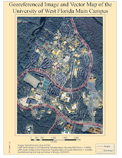
Wow this was such a challenging project. This project encompassed nearly everything we learned this semester. This required research. The primary tool was ArcGIS. Support tools included Erdas Imagine MS Excel, Powerpoint and Word.
A PowerPoint presentation accompanied by a written slide‐by‐slide summary is required as the final deliverables
Wednesday, April 28, 2010
Tuesday, April 6, 2010
Week 11 - Labels and Annotations
I learned a good bit about label and such but it took soooo much longer than the suggested times.
In this exercise, We wrote VBScript code to customize the text string for labels. Then modified existing labeling properties to create dynamic label callouts. Finally, used a variety of techniques to manually add descriptive text to the map.
Along the way I discovered some of the differences between dynamic labels and manually-created text. I also learned how to troubleshoot my application to distinguish between the two once I've added them to a map.
I like this one too. The red line is the hiking trail across Shivano
Tuesday, March 30, 2010
Week 10 - Using Raw Data
In this case we were tasked to work with raw data and tables to analyze property for a fictional developper.
It involved bringing in data and joining to our attribute table as a way of analysizing outside data within GIS. Then the four largest landowners in Gulf County, Florida needed to be located and symbolized. This was accomplished with data from the Florida Department of Revenue.
Here is where it got interesting to me. In order to join tables with a shapefile - there needed to be a common field. The field names did need to be identical but they do need to hold the same data. After that it was quite straight forward. It is a lab like this that reminds me how much I have learned this semester.
Tuesday, March 23, 2010
Bonus Exercise - Escambia County Black Population
Before and After
I chose Percentile map from week 3 because I wanted make a better map product. I also wanted to see how and if a different presentation would change the intended message. Remember that the data is exactly the same as before.
I had some friends over tonight and asked their impression of the two maps. half preferred the Proportional Dot map and half leaned toward the Equal Interval map. This was a fun exercise and sparked a lot of discussion about map content.
My very informal poll of my house guests tonight suggested that the primary improvement seemed to be map type followed my map design. And I agree. One person thought thought that the positioning of the graduated symbol in the center of the county districts could mislead someone to think that is the exact location of the black population.
The following was done to the map:
1: Switched from equal interval to Graduated Symbols
2: Switched from categories to dot symbols. Circles were chosen since literature indicated that people like that shape over all others
3: Changed the entire color scheme
4: Added Source
5: Added Map compiler information.
6: Expanded the neat line to create more useable area
7: Expanded a secondary title to better reflect the map message
8: Changed font schemes to better reflect the map message
9: Repositioned the Scale information and North Arrow
10: changed the title of in the table from "p_black" to "Percent Black Population"
This lab required us to do the following
1. Choose one of the laboratory maps that was created/altered this semester (or at least
was created using an Arc shapefile).
2. Visit the following website ESRI Mapping Center.
3. See the Map library that contains various cartographic effects that can be used in Arc.
4. Download and use as many effects necessary to help display the information effectively.
5. Post your final map to your personal blog.
Sunday, March 21, 2010
Week 9 - Vector Analysis Lab II
I liked this lab. I made me think about the logic of what was happening. I also liked that there was more than one way to get to the same result
Quiz Questions
Q1: Which tool did you use? Was there any noticeable difference between its results and the results from the instructions?
A1. I used the intersect tool to join the "road" and "water" buffers and it yielded identical results as with the union tool.
Q2: Which tool did you use here? Why?A1. I used the erase tool to remove the campsites that intersected the conservation areas. It excludes areas in the erase feature, that overlap the Water_Roads_Union layer.
Q3: How many features are in this layer? What is the area of the largest feature? What is the area of the smallest feature?
A3. I had 79 potential campsites. The largest was 7,765,034 square meters and the smallest was 748 square meters.
Wednesday, March 3, 2010
Lab 7 - Data Editing in ArcGIS
Topics covered: Editing feature classes and shapefiles, digitizing features, snapping & topology
Additional References: ArcGIS Help
Data Source: Download from ESRI & R: drive Week7.zip
Deliverables: 1 map (jpeg) 1 Exam
Thursday, February 25, 2010
Week 6 - Georeferencing Lab
 This was an interesting lab. I have some experience selecting relative control points so that aided my choices in points.
 Equilateral Triangles
One thing I remembered was thinking about a term called "strength of figure". Mathematically, the most stable triangle is the equilateral triangle. Using this thought, I tried to choose my points so that they created a network of triangles that came as close as possible to equilateral triangles. Just for grins and giggles, I also selected some at random and the RMS error almost doubled.
Deleting Points
I constantly looked at the RMS errors of individual points and deleted ones that started to get quite large. I think that I collected them in the wrong order (known to unknown) and that caused some HUGE errors. So judiciously using the delete key was quite helpful.
Saturday, February 20, 2010
Week 5: Data Input and Editing
So the elements that are in this map are
- County boundaries
- Cities and towns
- Public Land
- Roads
- Hydrography
- Land Cover
- Wetlands
I learned a ton on this lab. This took soooooo much time but I learned so much. Thanks to Sean's tip form the Discussion post about the data.. That was wonderful! The tip was"Open the attribute table for the layer and see if their is a field that describes each row of data....., right click on the layer and selected symbology, then on the left selected show categories. At that point there is probably only 1 category showing that says something like and has a check next to it. Uncheck the check and click the button at the bottom that says Add values or add all values. But before you do that change the Value Field to the field in the attribute table that held the description." There was so much more data than I knew was there until that point. Once I understood this, the rest of the lab came together nicely.
Thank goodness the USGS site with their Explorer tool worked. That is where I downloaded most of the information. The Florida site had it too but for some reason the download hung up every single time.
The main goal was to import 4 adjacent DOQQ, (the center piece here), and then add an adjacent Digital Elevation Model DEM and Digital Raster Graphic (DRG). The legend was intentionally left out since the three primary elements were clearly and unambiguously labled. Per the Thematic Cartography and Geovisualization text, "symbols that are self explanatory ... are normally omitted."
Notice the map collar, is this
Tuesday, February 9, 2010
Haiti Road Maps
I am a big, big fan of maps. The advantage of this map is that it is very useful for planning purposes. The primary drawback to this and many other maps is that the veracity of the source is generally not verifiable. In this case however, I was able to confirm that some of the "probably closed" roads were in fact, impassable. How could I do that? It turns out that latest update to google imagery was also about that same time. And the resolution of the imagery was good enough to show that a collapsed building had completely obstructed the road.
Week 4 - Projection Type Comparison
The objective of this lab was to depict the variability of acreage calculations when implementing different geographic projections. This was a very time consuming lab albeit rewarding.
The lab demonstrated how to make changes to datasets in ArcGIS. The three map projections were generated using the ArcGIS ArcToolbox, Projections and Transformations toolset, specifically the Project Tool to create new datasets from the original Albers projection. Microsoft Excel was used to create the Legend. I appreciated how products from other vendors (i.e. Microsoft) could be added to enhance the value of the GIS product.
Thursday, January 28, 2010
Week 3, Mexico maps 1, 2 & 3
The biggest challenge for me was to follow directions first and experiment later...it cost me sooo much time. It seemed that that I found all of the places to cause the map system to do something different than I intended because a box was inadvertently selected or deselected...
I think two issues for real world data sets would be completeness, and accuracy. It would make this kind of analysis so difficult the data was was erroneous or lumpy.
I think two issues for real world data sets would be completeness, and accuracy. It would make this kind of analysis so difficult the data was was erroneous or lumpy.
Sunday, January 24, 2010
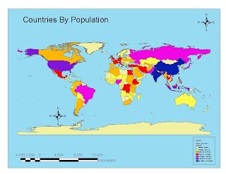
Week 2 - World Population Map

This was interesting.
One of the things that I paid attention to was the range of colors. In the last exercise, which included bad maps, there was one that was poor for those with color blind issues. Since that often has to do with blue and green, that thought process was incorporated into the design to minimize that effect.
My biggest challenge was due to my effort to clean up my desktop. I inadvertently closed the "tools" tool bar but did not remember that it was called "tools". Then I had to go through lots of tool bars until I found it again ... and laughed at myself. I did discover that if you double click on an empty space on the tool bar area it brings up a dialogue box and you can flip through these pretty fast.
Wednesday, January 20, 2010
Tourism map of San Diego
I had a lot of fun playing with this one. As with my previous post, I learned to use several tools that I had never used before. In the end I added a label showing where Qualcomm Stadium was since it was not obvious on the map.
Just for grins, I also saved the map as a screen snap. This works well but requires more editing after.
Just for grins, I also saved the map as a screen snap
Tuesday, January 19, 2010
Potential Youth Center Locations
The biggest issue I had actually had nothing to do with the assignment. For some reason a new Remote Access tool at work changed and subsequently prevented me from accessing the student account for three days...That had me sweating...
Subscribe to:
Comments (Atom)


