Thursday, December 8, 2011

THIS IS MY FAVORITE LAB!! It was so fun and intriguing to be able to look at a map through the eyes of Captain James Cook and then combine that view with current mapping data of today.

Objectives:
     1. Identify bias and geographic inaccuracy in early map documents
     2. Locate historic maps from online sources and import them into a GIS framework
     3. Manipulate historic maps and images into a georeferenced format for modern analysis
     4. Identify varying levels of georeferencing accuracy and factors that may influence results
     5. Use georeferenced historic maps to create compelling results to enhance report production and guide archaeological research

During the course of research as an archaeologist or historian, one will encounter many historical maps, charts and images, most of which will lack a current geographic reference system, and all of which will display some degree of geographic inaccuracy. In the past, cartographers were able to capture representations of the earth with ever-improving levels of geographic truth, and the beauty and interest of these maps, as well as the information they provide us about the march of exploration and advances in geographic science cannot be underestimated.

Even the earliest, least accurate maps can provide us with a wealth of information, not only about the area of study but the progress of trade, interaction of cultures (for better or worse), political and economic agendas and changes in past landscapes and cultures. As archaeologists, examining these maps and images provide an invaluable tool for gaining insight into human history. As geographers, we must appreciate their beauty and the obstacles that faced these early cartographers and the agenda that motivated them to brave unknown lands to fill in the ‘Terra Incognita’ and ‘Here be Dragons’ of the world’s vast spaces

As scientists and scholars, we are aware that everything in history must be viewed with a certain degree of healthy skepticism: not everything is as it seems. As we have learned, historic documents contain a certain latent agenda, which only the creator of that document can ever fully understand, and which we must try to eke out as best we can in order to correctly interpret the meaning of that document, identifying motive, bias and falsehood. The same holds true for maps: early explorers were funded by merchants, kings, queens, governments and private individuals, and were rarely motivated solely by a desire to explore. Trade, land acquisition and expansion of assets were primary motivators, even as they play a key role in our lives today. Even the most unbiased of explorers and mapmakers would introduce some level of bias in their documentation just by the error inherent in cartographic measurements throughout much of recorded history.

Deliverables:

     1. Create a final rectified map layout, using 50% transparency showing the rectified historic map document, Bing Aerial imagery layer
     2. Export the map to JPG and include in the process summary
     3. Upload the JPG of the final map to the student blog, with a paragraph describing the subject of the map and the general process you took to geo-rectify the map.

Synopsis:

We have learned about many sources for online map data, including the Library of Congress, historical NOAA charts, and the David Rumsey collection of digitized historic maps. We navigated to the David Rumsey online map viewer for the purposes of this lab, queried a map and downloaded the data to be geo-referenced in ArcMap. The map used for this exercise is Captain James Cook’s 1785 (published posthumously) map of Macau, at that time a Portuguese trading colony on the South China Sea. Cook, a world explorer and surveyor, is well known for his voyages across the uncharted expanses of the Pacific Ocean and circumnavigations of the globe for the Royal Society. This map of Macau was made during James Cook’s second Royal British Pacific Ocean Voyages expedition (1772 -1775) aboard the Resolution and Discovery, with the assistance of a certain infamous William Bligh. Although Cook was killed by Hawaiian islanders on his third voyage in 1779, his book of his voyages and discoveries, including many charts and maps, was published in 1785.

Examining this historic map will give us insight into the status of the colony in the late 18th century, and allow us identify structures and features that existed in the past that may represent archaeological resources in the modern landscape.
So here we are in 2011 with a scanned copy of one of his maps. Clearly this was copied from a book and there are little markings to use and no geo-references.

Image enhancement. So first a simple Microsoft tool to crop was used to the image to minimize if not eliminate the non-map features. Then it was enhanced a little to make the finer details stand out a bit more.
Base Map – Bing maps and world topo maps were added to locate the featues on the map.
Image rectification – Finally 16 points were used to spline the old image to the known image. You can see the side – by – side before and after comparison of the old map to the final product.

This was interesting to me since in the fairly recent past this would have been a much more arduous process.

Effects of Chicago Fire

Objectives:

As archaeologists, GIS may be utilized in innumerable ways to query historical, prehistoric, and geographic data to permit us to analyze events, patterns, and trends in the past. This week, we will utilize GIS to examine the urban impact of the Great Chicago fire. The applications of GIS in archaeological research are nearly limitless, and it is becoming increasingly important for the archaeologist to be familiar with the basic workings of GIS, and how they may be used to further interpret cultural resources. This week, we will work with a set of historical data to examine how this information can be used to analyze and model past events. Before we can move on to more complex uses of GIS in archaeological practice, we must first become accustomed to utilizing some basic tools to explore historical data. At the end of this lab, you will be able to:

  1. Query data by attribute and location
  2. Use historical census data to query population densities within a given study area
  3. Summarize results in tabular and graphic format
  4. Use Clip and Overlay tools to examine features within a given study area
  5. Using the “Kernal Density” tool in Spatial Analyst to visualize point data in raster form
  6. Visualize results three-dimensionally in ArcScene
Deliverables:
1. Create a final map showing the following information:
  1. Chicago_1869  
  2. Damaged Wards
  3. Chicago_1890
  4. Surviving landmarks constructed before 1871 and labeled  
  5. Landmarks constructed between 1871 and 1890  
  6. Location where the fire started
2. Process Summary with map (.jpg) included in body.
3. Upload the jpg to your student blog.

Assignment 1: Investigate Data
Examine the data provided. The data we are using for this assignment has been collected from various online sources. An important aspect of using archaeological data in ArcMap is knowing how to access the metadata and easily interpret the data without leaving the ArcMap framework. We will utilize some of the tools in ArcMap that will help us investigate data throughout the course.

Assignment 2: Add and Manipulate Data

• 0 – Jane Addams Hull house Jane Addams Hull House Association improves social conditions for underserved people and communities by providing creative, innovative programs and advocating for related public policy reforms. Jane Addams was a leader in securing schooling for children. Today, Hull House provides a comprehensive array of supportive services to hundreds of children and families each year.

• 1 – Soldier's Home, 739 E. 35th St. Chicago IL, 60616, is an Italianate style house in Chicago, Illinois, United States. The Soldiers' House is located at 739 E. 35th St. was built in a series of phases from 1864 to 1923 by William W. Boyington and other various architects. It was designated a Chicago Landmark on April 16, 1996. The Soldiers' Home is the last surviving building with exact association to the Civil War. During the war the home served as a hospital for injured soldiers. After the war it became a home for disabled Union Army Veterans.[1]

• 2 – The Wheeler Kohn House - The Wheeler Mansion is truly a Chicago treasure. Originally built in 1870, it is one of the last remaining stately mansions that survived the Great Chicago Fire of 1871. The residence was among one of the earliest constructed in the South Prairie Avenue neighborhood (Prairie Avenue District), home to Chicago's early mercantile and industrial barons and Chicago's first "Gold Coast" during the last quarter of the 19th century. After the property's meticulous restoration in 1999, the city recognized The Wheeler Mansion by honoring the home with the Preservation Excellence Award and the Friends of Downtown Award. The mansion is a Chicago Landmark (Wheeler/Kohn House), as well as a National Landmark because of its architectural attributes and important historical significance.

• 8 – Abraham Groesbeck House – 1304 W. Washington Blvd. Chicago, IL 60607 - Built in 1869, this Italianate-style building is one of few buildings to survive the Chicago fire. It started as the home and office of physician Abraham Groesbeck, but has also been home to the Cranes, Glessners, Harrisons, and Mary Todd Lincoln.

• 9 – Illinois and Michigan Canal The Illinois & Michigan Canal, completed in 1848, connected the Great Lakes to the Mississippi River watershed along a longstanding Indian portage route. The 97-mile canal extended from the Chicago River near Lake Michigan to the Illinois River at Peru, Illinois. It rapidly transformed Chicago from a small settlement to a critical transportation hub between the East and the developing Midwest. The towpath trail along the canal is a State park that runs through a rural and wooded landscape linking a number of towns laid out by the original canal commission.

• 11 – St Ignatius College Prep Building Excerpt from Chicago Landmarks website...

The culmination of Father Arnold J. Damen, S.J.'s work in Chicago, this building was opened in 1870 as St. Ignatius College. Loyola University originated from this institution but, since 1922, St. Ignatius has operated solely as a college preparatory school. The Second Empire-style edifice is among the oldest in the city, a rare and distinctive example of institutional designs pre-dating the Chicago Fire of 1871. Built: 1869; West addition, 1874, Architect: Toussaint Menard , John P. Huber, Address: 1076 W. Roosevelt Road, and Date Designated a Chicago Landmark: March 18, 1987

12 – Henry B Clarke House Museum , located at 1827 S. Indiana Avenue, Chicago, IL 60616, was built in 1836 for Henry B. Clarke, and is Chicago’s oldest house. The house shows what life was like for a family in Chicago during the city’s formative years before the Civil War. Its fascinating history began at a time when Chicago received its city charter and much of the area was still undeveloped prairie.

Over the years, the house survived fires, belonged to a church, and was moved twice – during the second move, the house was stuck in the air for two weeks. The house is now located in the Chicago Women’s Park in the Prairie Avenue Historic District, and operated as a museum by the Chicago Department of Cultural Affairs and Special Events

13 – First Baptist Congregational Church is a Baptist congregation now located in the former Union Park Congregational Church building, a Chicago Landmark at 60 N. Ashland Blvd. in Chicago, Illinois, USA. The church was designed by architect Gurdon P. Randall and built between 1869-1871. The First Congregational Church, founded in 1851, merged with Union Park Congregational in 1910. First Baptist acquired the building in 1970; the congregation's official address is 1613 W. Washington Blvd.

The church was built in what was then a very fashionable neighborhood of Chicago. Part of the church's historical significance lies in the fact that after the Great Chicago Fire of 1871, several essential civic functions were temporarily relocated to the church -- the Mayor's Office, the City Council, and the General Relief Committee. Many people who had been displaced because their homes had burned camped out in nearby Union Park.

Archeology - Paul Reveres Home


Objectives:

This week we will focus on incorporating historic records, documents and images into GIS map documents for archaeological interpretation. Sources of historic information are numerous, and in many cases are essential tools for ‘reconstructing’ and interpreting the historic landscape. Images, maps, and documents can serve as sources for quantitative data, may be digitized for incorporation into a map document, or may be linked directly to a document for easy visualization and reference. The possibilities for utilizing historic documents in a GIS format are endless, and the importance of knowing where to find these sources of information, how to interpret them, and how to incorporate them into a GIS framework is a useful skill in the archaeologist’s toolset. This week we will:
  1. Locate, evaluate and interpret sources of historic information online
  2. Link historic images and documents into a map document for visualization and report production  
  3. Link HTML site to a map document for enhanced resources interpretation and additional resources 
  4. Gain familiarity with ArcGIS Online and user-created shared interactive maps
Deliverables:

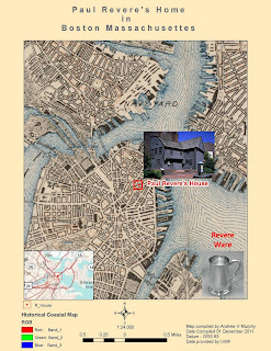
Create a final map in Layout view showing the following: historical map layer, Paul Revere house, Paul Revere portrait, original census record and html link to the Google Maps Street View image of the Paul Revere house (hint: insert a text box with the html). Make sure to include essential map elements such as a Title, scale, north arrow, legend, and source text. Do a little internet research and include a text box with a brief description of Paul Revere’s life and significance (three or four sentences). Try to imagine that you are creating a finished poster for a conference presentation: your map should be polished, present the data clearly, and should be aesthetically pleasing. Export the map to .jpg and submit to the Module 4 drop box.

Synopsis:

A good way to get a feel for the types, sources and availability of historic information is by examining an area with a plethora of historic documentation and a rich history. We will utilize historic census records and documentation to examine a famous site on the Boston Freedom Trail. You will learn how to locate, download, visualize and query census information and historical records, and will utilize that data to generate a final map document with linked historical documentation. Let’s get started!

Assignment 1: Locating Information

Base map Data

“The half of knowledge is to know where to find knowledge”: finding data to create a base map is perhaps the most essential and time consuming task that the GIS technician is faced with. For this exercise, most of the data has been collected for you, however it is imperative that you know how to locate and transform your own data.

Historical Records

The sources of historical data online can include museum websites, archives, libraries, universities, genealogy websites, and more. For the purposes of this lab, you will be required to register for the 14 day free trial of Ancestry.com (www.ancestry.com) although there are many sources for historical information; this website has many images, records and documents in one place and will serve as a good starting point for your research.
Assignment #2:

Generate Base map of Historic Boston

At times it may be difficult to find digitized historic data relating to your area of study. Internet searches may yield a plethora of modern shape files, but many historic data sources are not available to public domain due to security and preservation concerns. Fortunately, there are interactive web portals such as ArcGIS Online (www.arcgis.com) where other users of historical GIS may post the work that they have done for others to query. It is a good idea to be familiar with the site. For this lab, we will be utilizing one of the user-uploaded maps of the Boston Freedom Trail as part of our base map.

Friday, October 14, 2011

Emergency Incident with Online San Francisco Map Presentation

Scenario

Around 3:00am on May 15, 2003, a tractor trailer carrying 20,000 pounds of hazardous material overturned in downtown San Francisco. The CA state Police and local emergency responders both responded at the site to coordinate the accident response. In As City Planner for the city of San Francisco you have been asked to create maps for the police department as well as the local public in order to better aid in the evacuation efforts.
Problem

California state police arrived first and recorded the location with GPS receivers and identified the substance as hazardous. Officers needed maps showing the vulnerable area surrounding the accident and estimate of the population an households that needed to be evacuated, suggestions for possible shelters for the evacuees, and a traffic analysis designating detours for vehicles. The analysis also includes suggestions for helicopter landing site both for the medevac and to transport support personnel. The helicopter landing sites are near the Incident and Evacuation Zone.

The public also needs to have readily available maps so they can determine where to and not to go.  If they are within the Buffer Zone then they need to know where the nearest shelters-in-place are located and how to get there.

The Deliverables
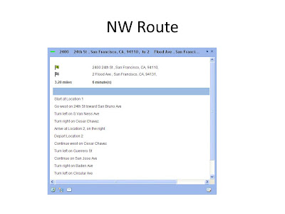
           ArcGIS Network Analyst slide presentation online (this link is being edited)

Wednesday, August 3, 2011

Weighted Location for Parents Move to Collier County FL

Abstract “GIS is used to analyze potential markets within Collier County that make up Naples and surrounding area. A raster-based, weighted model along with demographic data were used to find the ideal location(s) for simultaneously isolating the optimal residential locations with their other requirements. It was determined that a single tract (000400) within collier county met the weighted requirements as defined by the customer. ”Zielsdorf

These requirements included: Catholic churches, predominately white, middle income, hospitals, and community centers. This final model can be adjusted and used in the future to find secondary locations for additional marketing or replan efforts

An in depth interview of a couple who are planning on moving to the moderate climate off the coast of Florida. The analysis focused on their desires and the various requirements were weighted based on their specific inputs

Final Analysis
County Tract 000400 around Naples meets exceeds every requirement levied by the Murphy’s. Having visited Naples, interviewed my parents, studied the data and run the analysis, the result is something they could use to make a very well informed decision. They are typical customers and have been asking about further refinements upon seeing the data and seeing the possible opportunities and options they never knew existed. That is exactly what should happen.

Introduction
Choosing a place to live is a complicated decision influenced by many factors. One needs to balance personal preferences with work, budget, and family constraints. In this exercise, we made decisions about where to live using demographic data, property information, and such spatial factors as proximity to important landmarks. The preferences are prioritized by giving some factors more weight than others.

A key use of GIS in many businesses is to support decision making, such as where to site new locations. Deciding where to locate a business comes from weighing a variety of factors, such as population density, income level, distance from competitors, traffic, etc. One of the challenges is to decide what weight (prominence) to give the various factors. In this week’s activity, I use weighted overlays in ArcGIS making this task fairly simple. Before moving on, brainstorming the factors that might go into a particular location decision (e.g., where to build a new school or rent an apartment near a college) and consider how one may weight each of these factors.

An in depth interview of an elderly couple (my parents, Mark and Annie Murphy) who have decided to look for a new place to live since Mr. Murphy had brain surgery 2 years ago and never regained full physical control. It is now and most likely will always be difficult for him to walk without a cane or walker. This situation has also been very hard on Mrs. Murphy, who suddenly had to take the reins for managing the business and all the medical issue that come with being an octogenarian couple. So they are considering moving to a warmer climate, such as Naples FL, that will be conducive to a better life and better health care. There is a retirement community that specializes in serving those with prior military service. Since Dad is a proud former member of the Army Special Forces, this type of community would beneficial. Mr. and Mrs Murphy stated that they want to be able to visit their children regularly and vice versa so proximity to Amtrak or an Airport is important. There is one Rehabilitation center in Naples that has the necessary requirements. They are both outdoors people so that was also included in the evaluation.

Key Stakeholders – The key stakeholders are Mr. and Mrs Murphy, children, Children’s spouses, and grandchildren. 
 
Key Benefit – The key benefit to Mr. and Mrs Murphy will be a better and more robust living situation.

Objectives – The objectives for the Location Decisions Collier County - The GIS expert needs to find a site with the required characteristics as defined by the clients. In this case they want: http://www.gsd.harvard.edu/gis/manual/raster/index.htm  Catholic churches, predominately white, middle income, hospitals, and community centers.

Once potential areas are outlined, we will turn them into individual zones with the RegionGroup function and then create several other surfaces that will be used to evaluate the potential sites.

Refinements
This case study in the Naples area can be continually refined to include locations grocery stores, cleaners and other shops within walking distance. It can be further refined to consider bulk food stores such as Wal-Mart and Costco since they have stated that they currently shop at these and similar stores
Objective 1 – Gather the necessary data evaluation
Objective 2 – Calculate Euclidean distance from the following criteria established by the client
  • Location close to Naples Regional Medical Center
  • Location close to the Total Back Care Center
  • A neighborhood with a high percentage of people 65 years old +
  • A neighborhood with high White population
  • Near Major Transit (Airport, Train, Major Roads)
Objective 3 – Conduct a weighted analysis based on the client’s preference to live near the following locations considering various priority levels:
  • Rehab Center and hospitals
  • Hospital
  • Predominately White Christian population
  • Catholic Churches
  • Community centers
Objective 4 – Determine the best possible location to live based on Client’s criteria and analysis results.
Objective 5 - Create a meaningful set of maps, slides and documentation Clients can use for making smart decisions where to live based on their preferred criteria. They may choose this area or ask me to do another, either way it will be enlightening to think through the process and see the effects of their decisions.

Tools used for the Analysis.
The Primary tools that will be used are ESRI ArcGIS and MS office. Within ESRI’s ArcGIS the following tools will be used:
  • ArcMap
  • ArcCatalog
  • ArcGIS Spatial Analyst Extension
  • ArcGIS Model Builder
  • Euclidean distance tool
  • Feature to Raster tool
  • Join function
  • Clip tool
  • Data Export
  • Map Creator
Additionally, MS Office (Excel, Word, and PowerPoint) was also used in this analysis.

The general steps that will be taken to accomplish this lab are as follows:


Step 1: Create a base map of Collier County
Step 2: Calculate Euclidean Distance from Florida Rehab Medical Center
Step 3: Calculate Euclidean Distance from Catholic Church

Step 4: Create a Field for Percentage of Population 65+

Step 5: Convert Tracts to a Raster for Age Range and Reclassify

Step 6: Show locations of targeted Retirement Communities

Step 7: Create a Weighted Overlay with Each Factor Weighted evenly

Step 8: Create a Second Weighted Overlay based on their input

Step 9: Write a cogent analysis describing the differences between the two overlays
Final Analysis
County Tract 000400 around Naples meets exceeds every requirement levied by the Murphy’s. Having visited Naples, interviewed my parents, studied the data and run the analysis, the result is something they could use to make a very well informed decision. They are typical customers and have been asking about further refinements upon seeing the data and seeing the possible opportunities and options they never knew existed. That is exactly what should happen. For a power point presentation select Slides or Slides with Presentation Summary  for the full paper select Final Project Results

References
 a. Jenness, J. 2004. Weighted Mean of Points (weightmean.avx) Extension for ArcView 3.x, v. 1.2c. Jenness Enterprises. Found at: http://www.jennessent.com/arcview/weighted_mean.htm .

b. Dong, P. . (2008). Generating and updating multiplicatively weighted Voronoi diagrams for point, line and polygon features in GIS. Computers & Geosciences, 34(4), 411-421. Retrieved from http://linkinghub.elsevier.com/retrieve/pii/S0098300407001495  or http://www.sciencedirect.com/science/article/pii/S0098300407001495

c. Drobne, Samo; Lisec, Anka. (2009, November 1). Multi-attribute decision analysis in GIS: weighted linear Combination and ordered weighted averaging The Free Library. (2009). Retrieved July 19, 2011 from http://www.thefreelibrary.com/Multi-attribute decision analysis in GIS: weighted linear Combination...-a0216411796

Tuesday, July 12, 2011

Urban Planning: Location Decisions

Scenario

 
Choosing a place to live is a complicated decision influenced by many factors. One needs to balance personal preferences with work, budget, and family constraints. In this exercise, we made decisions about where to live using demographic data, property information, and such spatial factors as proximity to important landmarks. We prioritized the preferences by giving some factors more weight than others.

 
Background

 
Alachua County is a county located in the state of Florida (United States). The 2010 Census conducted by the U.S. Census Bureau reports a county population 247,336. The county seat is Gainesville, Florida, home of the University of Florida, and is also known for its diverse culture, local music, and artisans. Census 2000 reported 37.2% of Alachua County‘s workforce is related to education (Census.gov).

Analysis

First one has to examine the data, complete map documentation, and set the environments.  Then begin the analysis and to prepare the displays needed to address the problem. A good place to start any GIS analysis is to produce a locational or basemap to better understand the distribution of features in the geographic area being studied. A basemap of Alachua County showing places and federal lands.

The first analysis (Even Weight) is rather like asking my mother-in-law what she likes the best. She usually says that she “likes them all the same” which means we make basic set of decision now and their preferences surface later.
So divining, what the customers want at the beginning is very helpful since it at least provides a target. In this case we learn about the grandparents weighting of 40/40/10/10 percent. The weighting clearly shows the emphasis on their children and grandchildren.
The recommendation is really anywhere in the highlighted area (look at Weighted Results map). Most of the selected area is 3 to 5 miles from the children. The bus routes, take you right to the hospital, the school, and too the neighborhood. More refinement should be made after they visit some of the community centers. Also, they should look at the three areas (blue, red and yellow areas) to see what neighborhoods really strike their fancy. The grandparents can them make that target smaller/larger with more refinements on their needs. Note the choices above emphasized the proximity to the children’s home/Hospital and University and lessened the impact of age ratio and house values. There was only are that did not have any impact from either scenario. Notice that since the children live Near the Hospital, the proximity analysis works for either the children’s’ home or Hospital. That in effect eliminates the need for one map and simplifies the assessment.

 
A key use of GIS in many businesses is to support decision making, such as where to site new locations. Deciding where to locate a business comes from weighing a variety of factors, such as population density, income level, distance from competitors, traffic, etc. One of the challenges is to decide what weight (prominence) to give the various factors. In this week’s activity, I use weighted overlays in ArcGIS making this task fairly simple. Before moving on, brainstorming the factors that might go into a particular location decision (e.g., where to build a new school or rent an apartment near a college) and consider how one may weight each of these factors (1-10).

 
Learning objectives: Upon completion of this week’s activities, be able to:
  1. Explain how GIS is being used in urban and regional planning
  2. Describe how planners can use GIS
  3. Describe how a GIS enables demographic analysis
  4. Track changes to spatial features over time.
  5. Explain how land use and zoning plans are used to monitor existing urban activities
  6. Calculate Euclidean distance 
  7. Classify rasters using a defined interval 
  8. Calculate values using formulas 
  9. Convert features to rasters 
  10. Create a model and run various models 
  11. Use the weighted overlay process setting both scale and percentage
The connections for this week’s activities are the following:
  • Business, marketing
  • Public administration
  • Government
1.  Deliverable 1- A basemap of Alachua County including places, public lands, roads, and census tract the couple from project 1 chose to live within (given).
2.   Deliverable 2- (2 or 3maps) A single layout view showing a map of each of or a combination of the following parameters
      • Distance from grandkids (original couple’s location)
      • Distance from North Florida Regional Medical Center
      • Distance from University of Florida
      • Distance from Community Centers
      • Census tracts highlighting percentage of population Age 65 and up
      • Census tracts showing median house value
      • Bus routes
3.  Deliverable 3- A map showing two different weighted overlays.
  1. Process Summary (Student Worksheet): Explain your steps.
  2. Final Report for Grandparents/Clients


Monday, July 4, 2011

Base Map Application

Introduction

This is another example of how powerful and useful Local GIS maps are becoming.  The City of Naperville is still learning how to use this capability but they are also far ahead of most of the cities I have worked with.
The Local Government Basemaps template is a set of ArcGIS Map Documents that can be used to author the essential basemaps in a local government. The templates will help one to publish a series of high-quality basemaps using available authoritative content. These basemaps are the foundation for a variety of desktop, mobile and web mapping applications deployed throughout local government.  The General Purpose and Parcel Public Access basemaps at two different scales. 
The Local Government basemaps provide a consistent geographic context needed across all local government departments and agencies. They provide important reference information that supports daily decision-making. The basemaps orient map users and are typically combined with other map layers that represent operational information managed by a department and/or agency within local government. In some cases though, the basemaps themselves may serve as a finished product that can be used in a map atlas or other hardcopy product. 
 
I was not quite sure what was expected in the lab so I made a map from the base map created in this part of the lab.

Saturday, June 25, 2011

Homeland Security (Protect)

Deliverables:
  1. Process Summary (.doc)
    1. Explain your steps.
    2. Answer any questions (1) 
  2. Blog Post materials to your blog
  3. 3 Maps (JPEG) 
    1. Map of heliport.
    2. Map of ingress and egress points around heliport.Line of Sight
    3. Map with profile graph incorporated into it.  
    4. 1 JPEG (Exported from 3-D) 
    5. JPEG of 3-D line of sight 
  4. Power Point Presentation

Objectives: Upon completion of this lab students should be able to: 
  • Create a hillshade surface in ArcMap 
  • Create a new shapefile within ArcCatalog. 
  • View 3D data in ArcScene.
Section 2.1: Prepare Protect Scenario Map 1
In this scenario, a threat is made targeting the NORAD command center at Cheyenne Mountain. Due to the nature of this threat, the site is regarded as the primary critical infrastructure and a number of key resources in and around the site are considered secondary critical infrastructure
I. Add MEDS Data to Scenario Map
II. Create Buffer around Extended Area beyond Event Site

Section 2.2: Locate Critical Infrastructure
Locate those key resources within this zone that may be potential secondary targets. These sites will also require additional security measures to step up surveillance to monitor activities in and around them to prevent terrorists from staging secondary incidents that may threaten the safety of the people in the area.

  1. Select by Location (Completely Within) 
  2. Summarize Data in a Table  
Section 2.3: Protect Critical Infrastructure Maps 3 & 4

I. Create Protective Security Buffer Zone around Critical Infrastructure

Deliverable 1: Buffers of the Cheyenne Mt. Airport/Heliport
A map was created illustrating the buffer zone surrounding the Heliport within the larger buffer zone. Remember, we had an entire data set at our disposal. A reference map showing where in the U.S. this data was added. The military map template was used to implement this deliverable

  
Deliverable 2: SECURE INGRESS AND EGRESS ROUTES AROUND CRITICAL INFRASTRUCTURE
A map was created illustrating these points surrounding Heliport. The Military Portrait template was used per lab recommendation.

Secure Ingress and Egress Routes around Critical Infrastructure
A. Generate Hillshade
  1. Create new shapefile of surveillance points in ArcCatalog 
  2. Add new shapefile to map document
B. Generate Viewshed
C. Create line of sight
D. Create line-of-sight profile graph
Deliverable 3: Create Line of Sight Profile Graph
A map was created incorporating the profile graph into layout view of representative observation point and create a map illustrating completion of the task. Per lab directions additional layers/data frames were incorporated to add value to the map.

Deliverable 4: View 3-D Line of Sight;

This is a frame grab since ArcScene crashed each time the export was initiated. So as long as I was grabbing the Arc Scene, I chose to also grab the source and present it as a side-by-side view. Notice that the selected LOS line is down the center of the road to NORAD.
   

Section 2.4 Create Power Point Presentation
 Homeland Security and LOS.pptx This presentation summarizes the Prepare lab tasks (gathering and preparing data) and results for the Protect lab.  The conclusion, provides at least two examples of where and how a line of sight analysis could be used to aid homeland security.

Tuesday, June 14, 2011

Class Participation Lab - Summarize a Technical Paper

Assignment: Summarize Exploratory Spatial Data Analysis Techniques for Examining Urban Crime.  http://www.geography.hunter.cuny.edu/~dougwill/CRIME/web_pdfs/intro_ESDA_murray-etal2001.pdfAlan T Murry, Ingrid McGffog, John S Western, and Patrick Mullins.

This article provided an in depth detailing of “approaches for better understanding relationships of crime occurrences using a GIS and quantitative techniques”. The authors clearly explained the challenges of producing a quality GIS product (Examining Urban Crime): establishing what data is needed to meet the customer’s needs; determining how much data to put on the map while setting aside the basic map design theory; trying to sort through the wealth of data to be displayed by a GIS; and making a map or GIS product. The daunting goal of using a GIS in support of crime analysis is to produce products that tell the right story for the given audience.

I was most surprised to learn that with respect to the GIS there are no standard models for examining urban crime. There are many generalized assumptions that can be made but each must be tested for validity, accuracy, and precision. The panoply of data options combined with the ever growing GIS capabilities makes this kind of work quite exciting. GIS is still in its infancy and only in the last few years emerging and gaining acceptability in the study of crime events and the relationships to the physical surroundings.

Thursday, June 9, 2011

Analysis of DC Area Crime using GIS

Assignment: Complete the lab (4 maps total).

Deliverables:
  1. 4 Maps
    1. A basemap of Washington D.C which includes:
      1. Police Stations
      2. Crimes
      3. Roads
      4. Census Block group
    2. A map of police stations, locations of crime, recommendations for new substations.
    3. A density map of burglaries, homicides, sex abuse crimes
    4.  GRADUATES ONLY: A map showing schools with the highest number of crimes nearby
  2. 1 Bar Graph showing total crimes (from deliverable 1 map).
  3. Process Summary Worksheet (delivered to instructor)
    1. Fill in tables
    2. Answer questions 29 total for graduates
    3. Explain your steps
Objectives: Upon completion of this lab students should be able to:
  • Create a map showing crime in urban areas.
  • Create graphs using ArcMap¡¦s Create Graph Wizard.
  • Analyze crime data for urban areas.
Law enforcement agencies increasingly are adopting GIS as a tool to improve public safety. Officials can decide where and how to allocate their resources once they pinpoint crime clusters. Spatial data helps police explore various factors contributing to crime.


In this exercise we used data from the nation’s capital to perform a crime analysis. The data comes from the DC Metropolitan Police Department and is compiled yearly into a database available for download at http://data.dc.gov/

Process summary
The DC Metropolitan Police Department has the technology available for crime analysis to allocate patrol resources efficiently. Imagine that you are a department GIS analyst who has been directed to investigate the following:

  • Crime patterns in proximity to police stations to determine if current patrols are effective or adjustments are necessary, such as reorganizing beats and building new substations.P
  • Patterns of aggravated assault, homicide, and theft-related crimes.
  • Patterns of when crimes are committed.
Process.
Step 1. Examine the data
Step 2. Create a process summary. This is where we explore the data. Look for value, consistency, and relevance. Once these are acceptable, then produce a base map which in this case show police stations, crimes, and roads. You will also see a graph showing the number of occurances of each type of offence.

Then put it all together by producing a map of the police stations and the locations of the crimes.

Step 3. Document the Map. Keep good descriptive names and steps along the way to avoid confusion. Try to make it easy for someone else step in with little or no prior knowledge. Or for people like me, make the names easy to remember and the storage locations logical.

Step 4. Set the environments. This is a key step since the real world data is comprised of formats and for our needs, a variety of coordinate systems and/or map projections. In this case I followed a series of 13 steps to get this done. Then saved it and called it Crime_Baseline. I would use this baseline through out the lab and save many, many steps and thus avoid mistakes

Deliverable 1: A basemap of Washington D.C. showing police stations, crimes, roads and census block groups. Include a graph of total crimes.


Deliverable 2: A map of police stations and locations of crimes along with recommendations for new police substations sites.
Deliverable 3: Density maps of burglaries, homicides, and sex abuse crimes.
Deliverable 4: A map identifying schools with highest number of crimes nearby
  • Imported the juvenile crime data (following lab steps)
  • Converted to .shp since it would not take the XY data projection any other way
  • Created a 1000 foot buffer around the schools with Proximate tool (contained)
  • Joined those two files
  • Voila

Tuesday, June 7, 2011

Joplin Missouri, Tornado

Graduate Student Lab: Joplin, Missouri Tornado

Topics covered: Creating geodatabases, ArcGIS Explorer, creating emergency maps related to the Joplin, Missouri Tornado.
Data Sources: UWF, Joplin and U.S.Census Bureau
Assignment: See Below.
Deliverables:

2 Maps
  • A map of Joplin, Missouri showing county boundary and schools
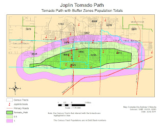
  • A map of buffered areas around the tornado path. The map should show the following:
    • School locations 
    • Population estimate 
    • Impacted roads 
1 Process Summary explaining the steps taken in each part of the lab.

Update Blog
  • Post maps 
  • Process summary
Objectives: Upon completion of this lab students should be able to:

  • Create a Geodatabase. 
  • Display emergency information via ArcMap.
  • Collect census, school, and boundary data from online sources.
Scenario
The city of Joplin, Missouri suffered significant damage. For this assignment your task is to survey the areas of Joplin that were impacted by this disastrous tornado. You will examine the tornadoes path; locate schools and shelter that were affected by the tornado and determine the population density of the area impacted.

Part I: First Response Analysis

Step 1: Created a Base Map of Jasper County, Missouri

  • Find data from online sources and bring into ArcMap: 
    • Jasper County Boundary 
    • Roads 
    • Schools 
    • Census Data (see steps taken in Tuscaloosa Lab write up)
    • Census Tract (see steps taken in Tuscaloosa Lab write up)
2. Symbolize the schools and streets appropriately.
3. Label Interstate and major roads.
4. Save the map document to my results directory

Deliverable 1: A map of Jasper County showing roads & schools
Step 2: Identify Tornado Path and Isolate Area of Concern 
  1. Create Buffers around the Tornado Path 
    • Used ArcMap to create a Multiple Ring Buffer (0.5 miles and 1 mile from the tornado path).
    • Made sure the Buffer Unit was set to Miles. There was an interesting effect here. Initially my inner ring for the multipath ended up as .05 miles. I finally figured out (since it was repeatable) that if I chose .5 mile then selected miles from the meter default, the sw sometimes converted the .5 meters to .05 miles. I caught the error when I used the ruler tool to check my distances
  2. Displayed the buffer by “unique value” with distance as the value field.
  3. Experimented with various map display techniques until the I found the one that best expressed what was trying to be told.
  4. Saved the map document.
The next step was to locate Evacuation Areas and Shelters (Schools in this case).

The schools are isolated:
  • Within the tornado path 
  • 1/2 mile from of the tornado path. 
  • 1 mile from the accident scene
Step 3: Add Census Data
A. Download data from the U.S.Census Bureau

  • 1. Download the Census Tract for Jasper County, Mo
  • 2. Download the Census Data Table
http://factfinder2.census.gov/faces/nav/jsf/pages/index.xhtml

The undergraduate lab was used for directions on how to “clean up” the data table. The key learning here was that there must be at least 2 columns of data that contain the identical names and unique values in both tables.

B. Join Census Table to CensusTract layer.
1. Once the data was “cleaned up” I used “Join” option on the Census Data Table to the Census Tract layer for Jasper County. This actually took several attempts until the join finally populated the fields with something other than . You have no idea how happy I was to see the table completed.

C. Determine Population and Roads Affected
Deliverable 2: A Map of the Buffered areas around the tornado path

Sunday, June 5, 2011

Joplin Mo. The value of an online GIS community

This is a map made using ArcGIS online map tool as part of a class participation exercise... Use this link or simply hit the map below.  http://bit.ly/iUF2rN


“Proper Prior Planning Prevents Pathetically Poor Performance”

An old Marine Major I used to work with often quoted this line and it applies very much to preparing for hazards such as Tornados. There must be a sense of urgency when preparing for such things as tornados. We must take responsibility to help where ever we can. As GIS practioners, we can make a difference. Understandably, some areas are more prone to these events than others. I live on the Gulf Coast where tornados are rare but dealing with hurricanes is highly likely. So I am prepared for that type of occurrence.

Who are the stakeholders in these events? “Everyone” is a stakeholder from the federal government down to the individual. In this assignment, we have been directed to think about the debris removal. The EPA site from our assignment has an excellent paragraph what we can do.

“Preparing a disaster debris management plan in advance can pay off in the event of a natural disaster. Planning can help a community identify its debris collection, recycling, and disposal options. Although the recovery process will take a long time, perhaps even years, careful planning will prevent costly mistakes, speed recovery, and avoid creation of more waste. A plan also can save money by identifying cost-effective debris management options and sources of help, increasing control over debris management in your community, and improving administrative efficiency” http://www.epa.gov/osw/conserve/rrr/imr/cdm/pubs/disaster.htm#cando  


Everyone can do something. We (as GIS) folks can put our names into our local authorities as volunteers to do the GIS work. We can use the ArcGIS site to collaborate. This would be useful to the victims, and the helpers (often times the same people). Most of us have printers so we can print out maps for all to use. As one of our esteemed colleagues living through the Joplin tornado pointed out, almost everyone can use a paper map. We can put debris collection sites, hazardous materials sites, first-aid sites etc on these maps. We can and should help because we can and will make a difference!

Saturday, June 4, 2011

A Study of the Tuscaloosa Tornado

Week 4: Tornadoes Tuscaloosa Tornado

There are several things to think about when working with a GIS.
What geographic area are you studying? In this case we are studying the tornado that hit Tuscaloosa Alabama. 

What decision do you need to make? There are so many to ask. Where are the Shelters in Place, what is the size and magnitude of the tornado? Has there been loss of life, where are the hospitals and the emergency support groups like the police, firemen, and EMTs.

What information would help you make the decision? In a sense, everyone is a key stakeholder. In this case, the emergencyworkers were the most critical. Are there  maps of the areas, pre and post tornado. Are there other weather coming to the area such as rain, and lightning? In the Joplin Tornado, a policeman died after being hit by lightning while assisting people in recovery.

Part I: Geodatabases
Summary Notes:
  • Once I added the basic layers I swithched views from data to map
  • Experimented with map scales and orientation until the area within the neat line came close to showing all the imagery, and the tornado path
  • Decide to stay with standard (vs. landscape)
  • Tinkered with colors… Acid green for the tornado path as an impact color 
  • Tornado Icon. Chose a large green dot for the tornadoes since the tornado Icon was too hard to see in this scene. 
  • Chose Red School (for the little red school house) 
  • Could easily see schools within the path: #34 Jamison Elementary, 44 Alberta Elementary, 55 University Place Elementary, 58Holy Cross Lutheran Child Development
  • Made the map with and without converting to Geodatabase. For these few layers it was much easier at the start to complete it with creating the Geodatabase. 
  • Convert labels to annotations graphics to enable individual editing.
  • Added inset for spatial context.
  • Spent much time working on the map composition so it would tell the story I intended 
  • Changed the Road setting several times. Will improve it again for the next map 
  • Sort legend in terms of importance on the map
  • Labeled Interstates and major roads.
  • Added all essential map elements (north arrow, legend, map scale, etc)
  •  Exported map. Deliverable 1 done (at least for now) Most likely tweak it later as I think of ways to improve it.
Deliverable 1: A map of Tuscaloosa County showing roads, schools, and aerial images.

Part II: First Response Analysis
Summary Notes:

  • Throughout process I am highlighting and adding digital notes the TornadoesLab.pdf file to ensure which steps have been completed
  • Created first map saved as deliverable 2a 
  • Added Buffer then saved as Deliverable 2b archived 2a
  • Visual count as a sanity check for estimates later on
  • Ran the MultiBuffer tool 
  • Once Multibuffer was complete, I measured the distances to ensure they were in fact, .5 miles and 1.0 miles of buffer 
  • Played with the layer organization, colors and transparencies until I got this right. 
Key thought.  When working on the map composition, keep foremost in your mind what story the map has to tell.  It must be done in such a way that if my Mom picked it up, she would understand the intent of this product.

Deliverable 2: A map of the buffered areas around the tornado path.  The map should include:
  • Schools within the tornado path, 0.5 miles and 1.0 miles from the path.
  • A population label on each census tract
  • Roads impacted by the tornado path


Part III: Animation
Deliverable 3: Post the video as a web link to your blog including a brief description along with your summary.


http://students.uwf.edu/avm6/Tornado3.avi

This took three tries. In the end I deleted everything and on the third try it worked like a charm

Part IV: Create a KMZ to view Tornadoes in Google Earth
Notes:
This was interesting and has the potential to be VERY powerful as a community GIS. Anyone with a computer can logon and use this tool. They can add and/or use existing map products. It was fun to take a shape file, convert it to a .kmz and drop it into Google Earth and then put it into my class blog.

Deliverable 4: Post the kmz file as a web link to your blog including a brief description along with your summary.
Google Earth Tornado Path 

Download Google Earth for PC, Mac, or Linux to use the GE Tornado Path link.  If you are not so inclined then click this link for a Screen Grab of Tornado Path in Google Earth

Sunday, May 29, 2011

Hurricane (A Study of Wilma effects in Key West FL)

Background:
In 2005, Hurricanes Katrina, Rita, and Wilma destroyed homes, businesses, infrastructure, and natural resources along the Gulf and Atlantic coasts. In the aftermath of the storms, federal, state, and local governments, service agencies, and the private sector responded by helping to rebuild the hurricane-ravaged areas and restore the local economies. GIS helped responders assess damage, monitor the weather, coordinate relief efforts, and track health hazards, among many other critical tasks, by providing relevant and readily available data, maps, and images.

Objective:
In this week’s project, we used some of the same data that guided critical decisions, such as funding and safety measures.  The focus area was Key West Florida and the impact of the storm surges from Hurricane Wilma.  The amount of flooding was really quite dramatic.  As you look at the three maps below, first look that the elevation map, then segue to the two different flood maps.  It also dramatically shows how important it is to be prepared for events such as this, especially if you live in areas prone to hurricanes.

Deliverables:
  1. A map of elevation and bathymetry of Key West and Key West places and streets
  2. A Map of flooded land in Key West after the two storm surges
  3. A bar graph showing the percentage of total flooded land by land-cover type
  4. A map showing infrastructure and heath facility destruction
  5. A table showing various land types measured in acres and square miles
Notice the highest elevation is 3.75 meters.  The contour map on the right is another ways to portray elevations. 


Notice the amount of flooding on the various land types.  As you look at the maps, you can see the few areas not flooded highlighted in red. The legend on the left helps to identified four types of land cover: 1) developed, 2) barren, 3) scrub/grass and 4) wetlands. The flood was devastating to Key West.
Note the infrastructure at risk (Hospitals, Airfield, Churches, schools and roads) during a flood.
Storm Surge
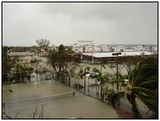
Hurricane Wilma flooded a majority of the land in Key West, FL. There were two separate storm surges the highest was 8 ft (2.4m) from the Gulf of Mexico completely inundated most of the lower keys.
Low-lying areas of Key West and the lower Keys, including major tourist destinations were under up to 3 ft (.9 m) of water from the [initial] storm surge. 60% of the homes in Key West were flooded.[1] Much of the original areas did not flood due to their higher elevations of 12–16 ft (3.7-4.9 m).[1] The surge destroyed tens of thousands of cars throughout the lower Keys and many houses were flooded with 1–2 feet (.3-.6 m) of seawater. The peak of the [second] storm surge occurred when the eye of Wilma had already passed over the Naples area, and the sustained winds during the surge were less than 40 mph (64 km/h).[1]

FEMA has a graph (seen below) that maps out the predicted vs actual surge. It does much to explain the surprise on the island.  See how the blue predicted lines varies significantly from the actual surge.
Looking at total acreage, the developed land were the most flooded. In terms of percentage, it was nearly 100% flooding for all categories except some of the developed areas on higher ground. Almost all of the schools, churches and streets were flooded. The two hospitals and the airport were also flooded by the storm surges. Of the developed land, 1,770 acres were flooded.   Hurricane Wilma’s two storm surges devastated the majority of Key West. 

Restoration Plan
I think two things should happen in parallel. There should be a restoration plan and a plan to update the hurricane models. Given that Key West is a small area, the costs should also be taken into consideration. In other words, determine what is most important and what efforts will give the biggest bang for the buck.

The initial restoration effort should focus on rebuilding the hospital and building a seawall around the one in the lower elevation. The next step in restoring the community could be the addition of Heliports near or on the Hospitals since rebuilding an airfield would be cost prohibitive. A sea wall could be built around the main runway.

The arterial infrastructure should be next. Repairing streets would allow residents to return and rebuild their homes and businesses. The low sections of the central road corridor could be elevated more to allow for an escape route in future hurricanes. Given that this is a big tourist area, large ships regularly come into port. These ports could be used to evacuate more people.  Ferries could be added to assist moving people and cars.

The flooded wetlands will take a much longer time to recover and perhaps some conservation agencies can assist in restoring these areas. Additional sea buoys could be added to improve the surge prediction models.

Updating the Key West Hurricane evacuation plan would be very beneficial. This will help to ensure everyone is working together. It was clear that general hurricane preparedness could be improved. It seemed from the literature about that the residents lacked a sense of urgency prior to the event. We witnessed a similar effect prior to hurricane Rita. So there needs to be a coordinated effort from the grass roots up and the government down to teach and prepare for future events since it is not a question of “if” but “when” it will happen again.


[1] http://en.wikipedia.org/wiki/Effects_of_Hurricane_Wilma_in_Florida#cite_note-8